K2LD
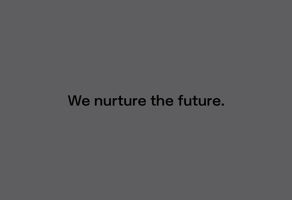
International Architectural and Interior Design studio K2LD are committed to investing in people and projects of the future. With established, growing and ambitious practices based in Melbourne and Singapore, the firm embarked on ushering in a new era for the business by developing a new brand strategy alongside co-design consultancy Everyhow. A vision to ’Nurture the Future’ became the organising idea for Grosz Co Lab to breathe life into and build an expressive new identity platform from.
We sought to provide a cohesive brand identity system, consistently underpinned by a robust master brand, yet with flexible elements that allowed shifts in mood and tone as needed. The visual system provides the brand with a rich and evolving language – speaking resonantly and responsively to reflect differing project types, markets and stakeholders.
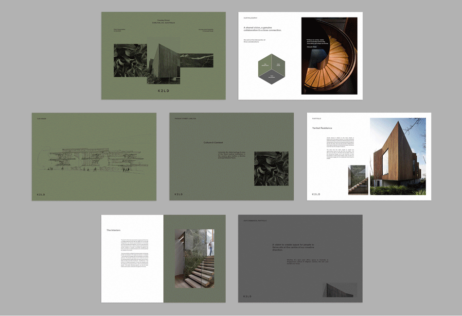
K2LD always work at the intersection of three considerations: site opportunity, client vision and practice philosophy. Throughout the development of their visual identity we were continually drawn to K2LD’s own ethos for inspiration: “Each brief is different and deserving of a bespoke approach and solution” and “We take people on a journey”. The expression of this is a visual brand ‘world’ based on continually exploring the relationships of groups of 3 complementary components - continually oscillating and adapting to context, purpose and environment.
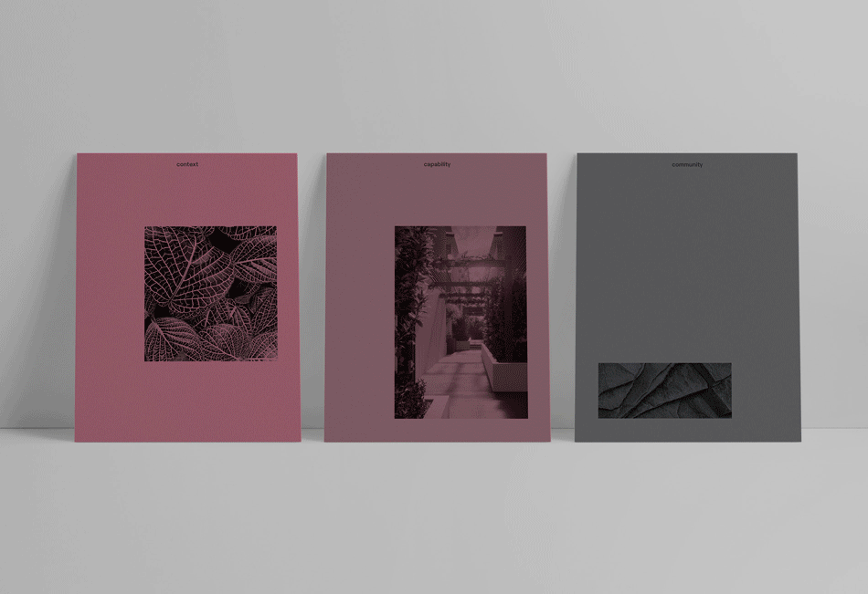
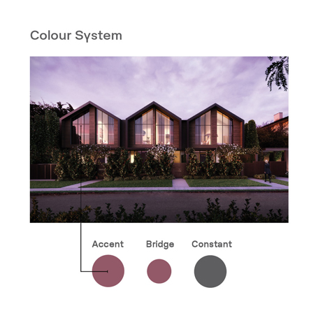
A UNIQUE SYSTEM OF COLOUR
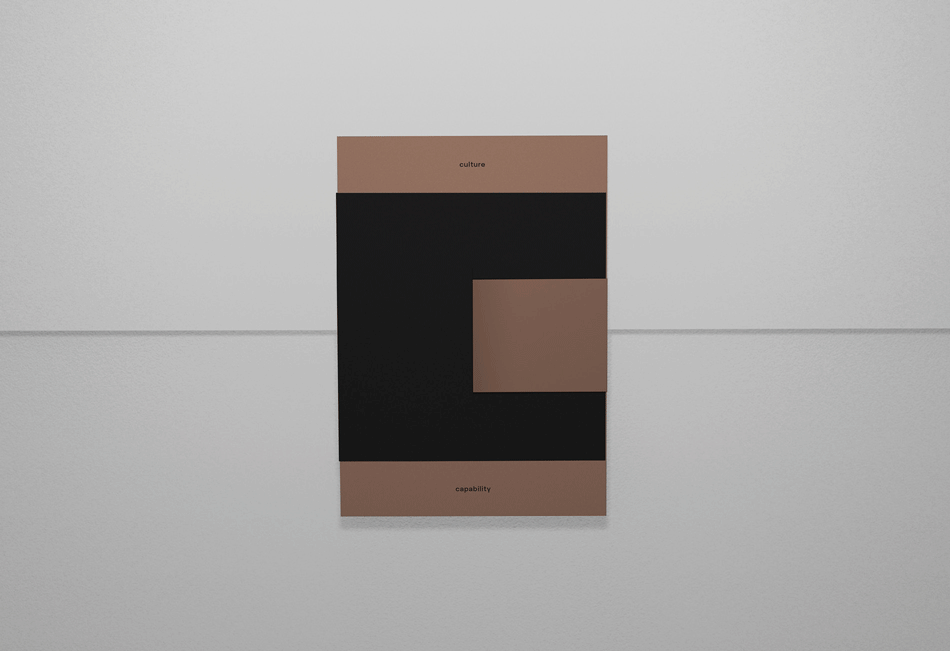
We developed a secondary system of colour that reflects K2LD’s unique approach to each brief and opportunity – one not weighed down by a singular aesthetic or trend. The 3 part colour system allows the practice to also express itself effectively and thoughtfully to speak to K2LD’s diverse audiences. An algorithm based tool was developed to enable the team to easily create new palettes. Each colour outcome in this ‘A. B. C.’ sequence has a role and inter-connected relationship to the other.
A. ACCENT – The ever-changing 'accent' colour expresses opportunity – what’s possible, what’s inspiring, what pulls focus, what can be achieved. It can reflect context or set a tone. It can be highly emotive & communicative, or simply complement the greater metaphor or aesthetic of an individual project.
B. BRIDGE – The 'bridging' colour represents coming together through relationships and being on a journey – a shared dialogue that develops when bringing something new into reality. This generative colour is unique to every 'Accent' & 'Constant' combination and ensures harmony across all K2LD colour expressions.
C. CONSTANT – This warm grey is the 'K2LD constant' - it provides confidence, stability and consistency. Context, opportunity & perspective can shift and move around this - however all communications are always tempered and grounded in this reassuring manner.
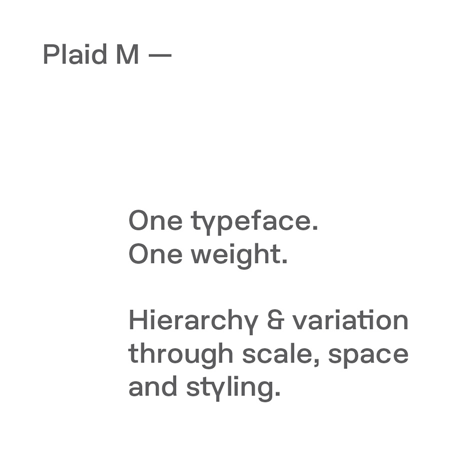
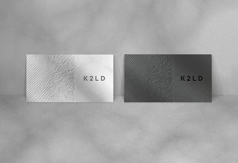
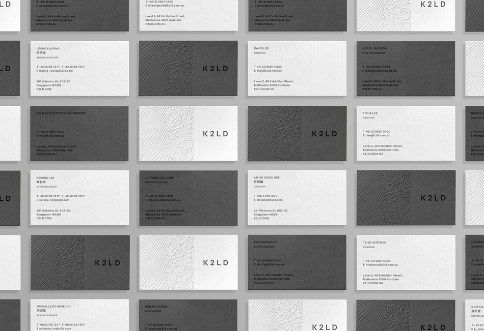
ONE TYPEFACE. ONE WEIGHT.
One universal typeface was selected for use across the practices with a singular weight that could speak to diverse audience types.
We draw reference from architectural principles.
By considered use of space, case and scale variation, the introduction of information hierarchy can be employed when needed.
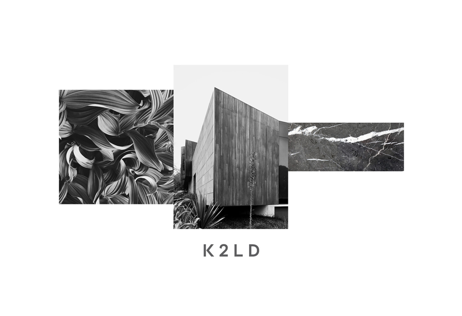
A NESTLING CONTAINER SYSTEM
We created a supportive visual language system that could illustrate a project’s journey, house a defining metaphor or reflect the intersection of K2LD’s three guiding considerations.
These frames are encouraged to be reconfigured across applications to form new spatial relationships, and could include project imagery, inspiration or concepts.