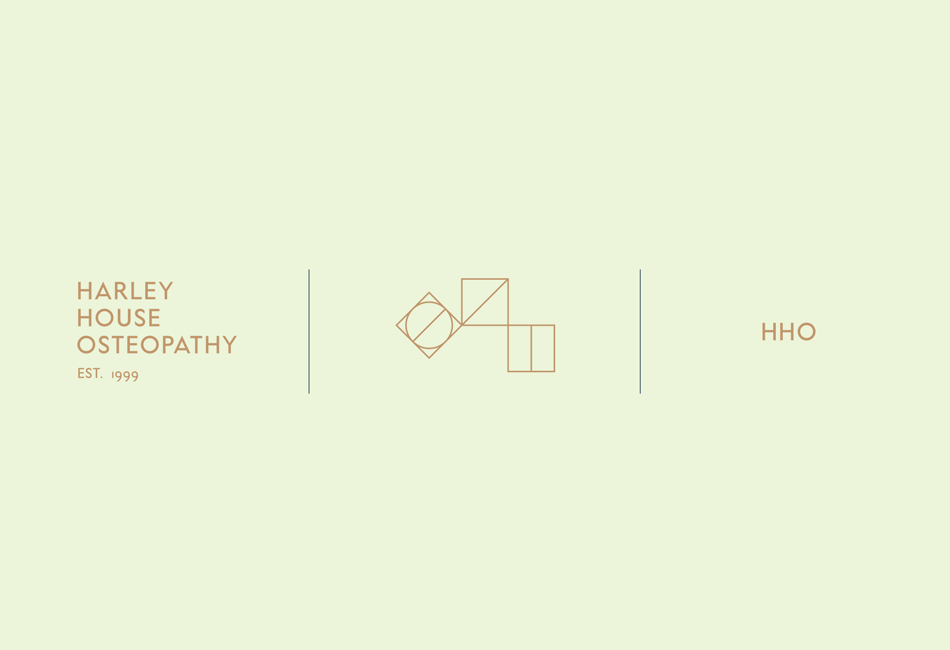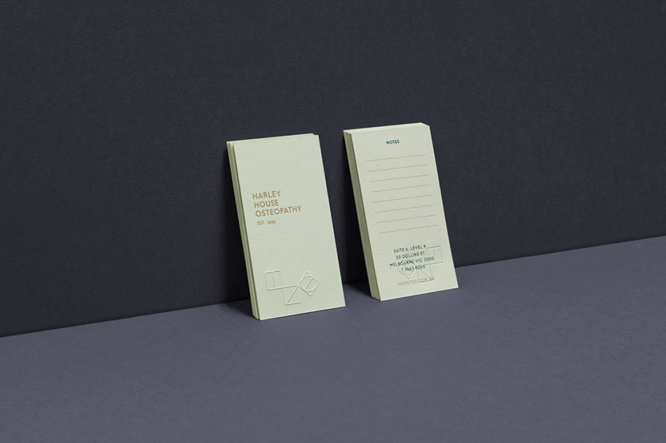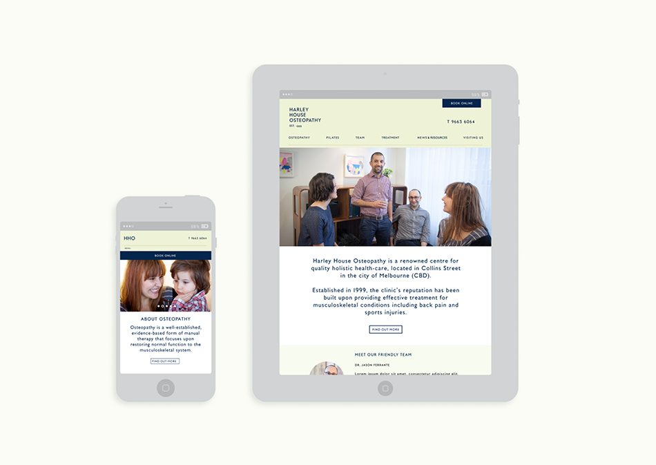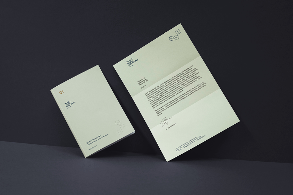
HARLEY HOUSE OSTEOPATHY
Founded almost 20 years ago, Harley House Osteopathy is an inner city healthcare practice with a reputation for personable, tailored and highly experienced patient treatment.
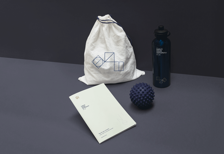
We created a restrained and flexible identity system, drawing on Italian modernist style – referencing the heritage of the founding business partners. The key visual elements consist of a crafted logo and a symbol that rotates direction regularly to reflect mobility and modernity. Made up of three geometric shapes the symbol represents each of the clinic’s three Directors. The rejuvenation of the practice's identity seeks to speak to an audience of inner city professionals and an existing loyal customer base, with the view to attract new enquiries and encourage client referral through social media activity with a clear and confident tone of voice.